Using Machine Learning Algorithms to Provide Deep Insights into Cellular Subset Composition
Objective
Introduces a 20 marker panel suited for acquisition on the CytoFLEX LX flow cytometer. Visualization of the data using viSNE, FlowSOM and SPADE on the Cytobank platform will be explored. A manual gating strategy using Kaluza Analysis will be shown and compared to the subsets identified by unsupervised clustering with FlowSOM on the Cytobank platform.1,2 The unsupervised nature of many of these algorithms reduces bias that can be introduced by manual gating of known subpopulations and enables the researcher to identify unexpected phenotypes. The reduction in hands-on time required to achieve an exhaustive analysis of high dimensional data sets using machine learning algorithms compared to manual gating represents an additional advantage.
To generate the data used in this Application Note, blood samples were stained with a 20 color antibody cocktail described below (Table 1) prior to red blood cell lysis using Versalyse in accordance with the standard procedure (Part Number IM3648). Stained samples were acquired on a 6 laser CytoFLEX LX flow cytometer. The Filter configuration described below has been applied to ensure optimal detection of each dye.
Table 1. Panel Composition for 20 marker Immunophenotyping using the CytoFLEX LX Flow Cytometer.
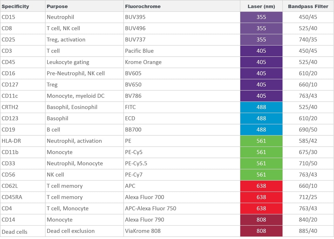
Compensation and data transformation using logicle scaling was performed using Kaluza Analysis software and compensated, logicle transformed data was exported to the Cytobank platform using the Kaluza Cytobank Plugin. Kaluza Analysis was also utilized for biaxial gating and manual population identification.
In preparation for machine learning assisted data analysis, debris, doublets and often also dead cells or other unwanted events are removed. These events do not add information to the downstream analysis, could negatively impact data display and confound statistical results if not identified and excluded appropriately. Depending on the desired data visualization and research questions, it may be of value to pre-gate on the population of interest for further analysis (Figure 1).

Figure 1. Data Cleanup in Kaluza Analysis. Doublets were excluded based on forward scatter signal area versus height followed by gating on white blood cells based on forward and side scatter characteristics. Cells negative for ViaKrome 808 (Part Number C36628) were identified as viable and further classified as Leukocytes based on CD45 expression. Data analyzed using Kaluza Analysis Software. Plots are for illustration purposes only.
For the manual identification of cellular subsets in human peripheral blood samples a gating strategy based on prior published knowledge of marker expression patterns was established using Kaluza Analysis Software.3
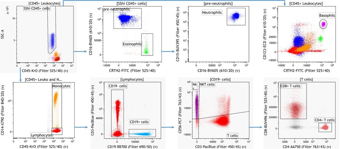 Figure 2. Knowledge-driven Identification of Major Leukocyte Subsets. Data analyzed using Kaluza Analysis Software. Plots are for illustration purposes only.
Using machine learning tools it is possible to identify cellular subsets without bias and independent of prior knowledge. Dimensionality reduction algorithms like viSNE are able to visualize the information contained in a high dimensional data set in a single 2D plot 1. Clustering algorithms such as FlowSOM are able to automatically identify and group similar cells based on similarities in marker expression.2
For further analysis of the data sets, viSNE was used for dimensionality reduction for all gating markers also used in the manual gating steps outlined in Figure 2. This allows the visualization of the information contained in these 11 markers (CD45, CRTH2, CD123, CD15, CD14, CD16, CD56, CD3, CD4, CD8, CD19) in a single 2D plot. viSNE is a method for reducing high dimensional data to two dimensions and thereby enabling rapid exploratory data analysis and visualization of complex results. For cytometry data, this may assist with the categorization of events/cells into biological populations. Cells that are phenotypically similar will be close to each other and form an island. A contour plot of the resulting viSNE map is shown in Figure 3A.
Following the dimensionality reduction, a FlowSOM analysis was performed to automatically cluster the cells into 12 so-called metaclusters. Running FlowSOM on the population-defining markers and to display the resulting clustering data overlaid on the viSNE map can facilitate the quality assessment. If further iterative adjustments of the algorithm run settings are required to optimize the results, this visualization may help compare different runs and provides a starting point for analysis of clustering data.
In the data set analyzed here a good correlation between the viSNE islands and the FlowSOM metaclusters can be observed (Figure 3 B). To quickly identify phenotype of each metacluster it can be helpful to build a heatmap view of the FlowSOM metaclusters by clustering (Figure 3C).
 Figure 3. Subset Identification Using viSNE, FlowSOM and a Heatmap Display. A) Contour plot of the viSNE map B) viSNE map with FlowSOM metaclusters as overlaid figure dimensions C) Heatmap visualization of marker expression by FlowSOM metacluster. Data was compensated and logicle transformed using Kaluza Analysis Software and uploaded to the Cytobank platform through the Kaluza Cytobank Plugin. viSNE was run on 11 population-defining markers of 3 samples with 3000 iterations, 30 perplexity and 0.5 theta. FlowSOM settings are 12 metaclusters and 121 clusters with hierarchical consensus clustering. Plots are for illustration purposes only.
The dot plots colored by channel functionality, which colors each event in the viSNE map according to its intensity on a channel within the dataset, can be used to show why dots in the map are nearby each other or what marker expression pattern are similar between events within a viSNE island. Figure 4 illustrates the marker expression for CD19, CD4 and CD8 on the viSNE map and in comparison to the FlowSOM metaclustering.

Figure 4. Expression Levels of Subpopulation Markers on viSNE Map. A) CD19 expression B) CD4 expression C) CD8 expression D) viSNE map with FlowSOM metaclusters as overlaid figure dimensions. Data was compensated and logicle transformed using Kaluza Analysis Software and uploaded to the Cytobank platform through the Kaluza Cytobank Plugin. viSNE was run on the Cytobank plugin on 11 population defining markers of 3 samples with 3000 iterations, 30 perplexity and 0.5 theta. FlowSOM settings are 12 metaclusters and 121 clusters with hierarchical consensus clustering. Plots are for illustration purposes only.
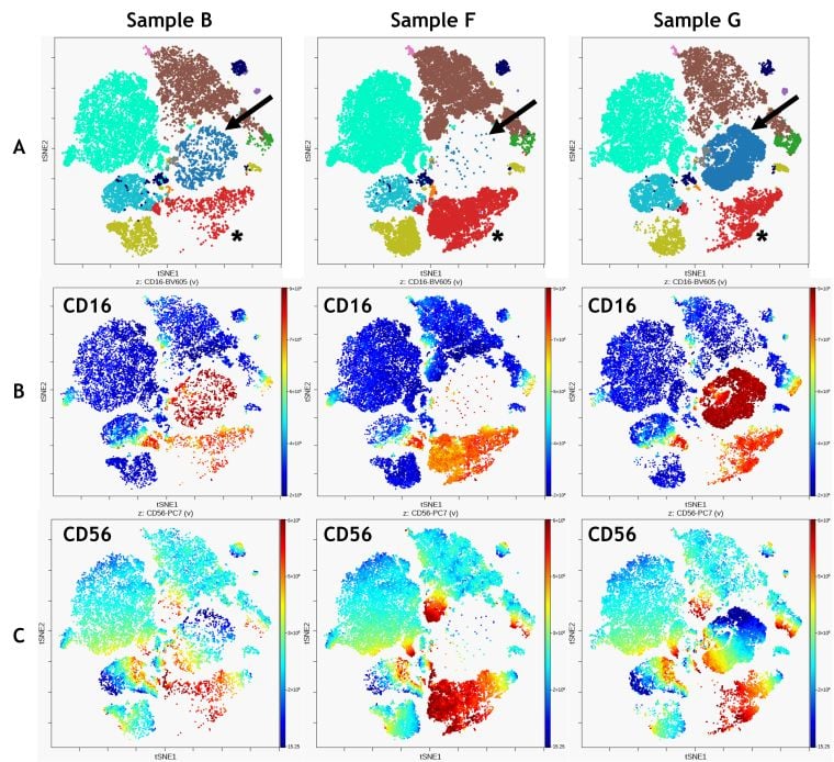
Figure 5. Comparison of 3 Samples. A) FlowSOM clustering overlaid on viSNE map, arrows indicate metacluster 1, asterick indicate metacluster 12 B) CD16 expression C) CD56 expression. Data was compensated and logicle transformed using Kaluza Analysis Software and uploaded to the Cytobank platform through the Kaluza Cytobank Plugin. viSNE was run on the Cytobank on 11 population defining markers viSNE was run on all CD45+ Leukocytes of 3 samples with 3000 iterations, 30 perplexity and 0.5 theta. FlowSOM settings are 12 metaclusters and 121 clusters with hierarchical consensus clustering. Data was compensated and logicle transformed using Kaluza Analysis Software and uploaded to the Cytobank platform through the Kaluza Cytobank Plugin. Further data analysis was performed on the Cytobank platform. Plots are for illustration purposes only.
Combining viSNE and FlowSOM allows qualitative comparisons between samples that may be enhanced by visualizing the expression of specific markers on the viSNE map (Figure 5). The comparison shows that CD16+ population identified as metacluster 1 (Figure 5 A, blue, arrow) is prominent in sample G but virtually absent in samples B and F. It also shows an abundance of CD56 bright cells in metacluster 12 for sample F (Figure 5 A, red; asterisk).
Another unsupervised algorithm that may be used for the identification of groups of similar cells is SPADE. SPADE stands for "Spanning-tree Progression Analysis of Density-normalized Events" 4. SPADE clusters phenotypically-similar cells into a hierarchy that allows high-throughput, multidimensional analysis of heterogeneous samples (Figure 6). Bubbles may be added to assign user-defined population thresholds to the various computational populations (clusters) found by SPADE.
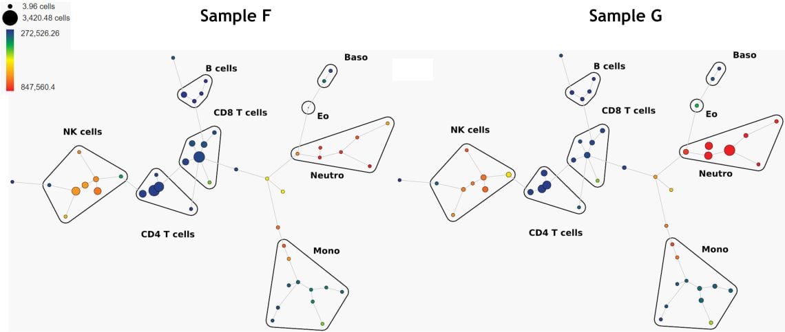
Figure 6. Comparison of 2 Samples, SPADE Trees Colored by CD16 Expression. Data was compensated and logicle transformed using Kaluza Analysis Software and uploaded to the Cytobank platform through the Kaluza Cytobank Plugin. SPADE was run on 11 populations defined with down-sampling to 10% and 50 nodes. Plots are for illustration purposes only.
A deeper immunoprofile of the respective leukocyte populations can be obtained by extending the manual gating strategy. Again, this is generally based on prior knowledge of expression patterns. An example for the CD4+ T-cell subset is provided in Figure 7.

Figure 7. Knowledge-driven Identification of Regulatory T-cells and their Subsets. (A) CD4 T cell memory subsets gated on CD4+ T cells excluding Tregs (B) and CD8+ T cell memory subsets. Data analyzed using Kaluza Analysis Software. Plots are for illustration purposes only.
Comparisons between samples can be done by comparing plots or statistical results and by utilizing overlay functionalities or the Kaluza Comparison Plot (Figure 8). This approach is also most often guided by assumptions on likely differences.
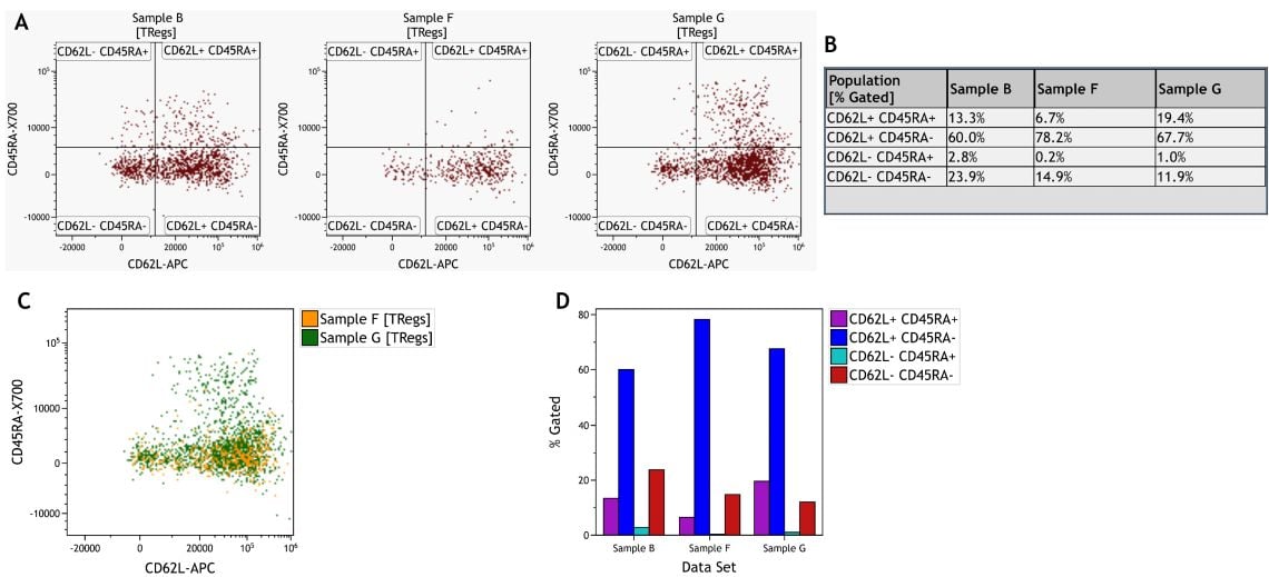
Figure 8. Comparison of Treg Subsets Across Samples. A) Individual dot plots per sample. B) Information Sheet with statistical results per sample and subset. C) Dot Plot Overlay of two samples. D) Comparison Plot visualizing % Gated per subset and sample. Data was analyzed using Kaluza Analysis Software. Plots are for illustration purposes only.
For unsupervised identification of T cell subsets, a viSNE analysis was performed using CD3+ T cells as input population. Figure 9 A shows expression of CD4 and CD8 on the viSNE map. Following the same manual gating approach as before (see Figure 7), different CD45RA and CD62L expression patterns were identified using a quadrant gate on pan T cells and visualized on the viSNE map (Figure 9 B). Lastly, hierarchical consensus clustering was performed using FlowSOM to identify 10 metaclusters (Figure 9 C). Both manual gating and unsupervised clustering result in the identification of similar populations.
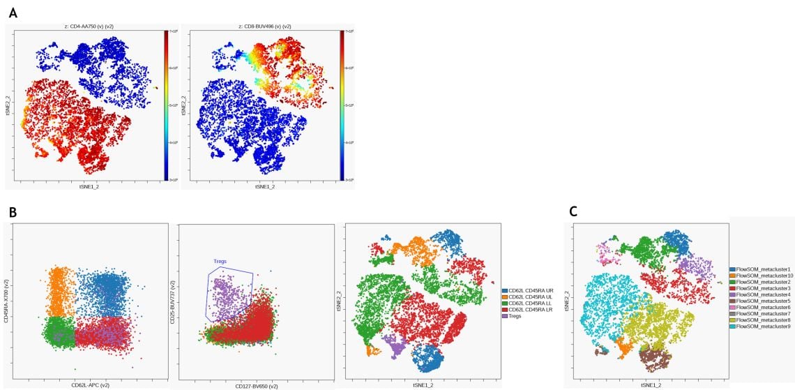
Figure 9. Unsupervised Analysis of T Cell Subsets. (A) viSNE was performed on the Cytobank platform with 2000 iterations and a perplexity of 50 and CD4 (left) and CD8 (right) expression are visualized on the resulting viSNE plot (B) CD62L and CD45RA expression patterns (left) as well as regulatory T cells (middle) were identified using manual gating and populations overlaid on viSNE map. (C) FlowSOM clustering was performed using hierarchical clustering on normalized data to detect 100 clusters and 10 metaclusters. Metaclusters are shown on viSNE map. Data was compensated and logicle transformed using Kaluza Analysis Software and uploaded to the Cytobank platform through the Kaluza Cytobank Plugin. Further data analysis was performed on the Cytobank platform. Plots are for illustration purposes only.
Figure 10 shows the comparison of CD8+ memory subset identification using manual gating and unsupervised clustering with FlowSoM.
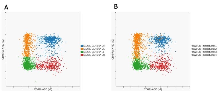
Figure 10. Comparison of CD8+ T Cell Memory Subsets Identified by Manual Gating. (A) and FlowSOM (B). Data was compensated and logicle transformed using Kaluza Analysis Software and uploaded to the Cytobank platform through the Kaluza Cytobank Plugin. Further data analysis was performed on the Cytobank platform. Plots are for illustration purposes only.
Summary
Data for three donors obtained using a 20 marker panel acquired on a CytoFLEX LX was used to show a manual gating strategy to identify leukocyte subsets as well as a deeper analysis of T cell subsets. The use of viSNE to visualize high dimensional data in a 2D viSNE map was shown and the use of viSNE and SPADE to compare samples was discussed. Finally, automatic cluster identification using FlowSOM was compared to the results of manual gating. Machine learning tools such as viSNE, FlowSOM and SPADE can be helpful in visualizing high parameter data and in the unbiased identification of cellular subsets.
Tips for Success
For detailed instructions on using Kaluza Analysis Software refer to Kaluza IFU C10986 , detailed instructions on using the Cytobank platform can be accessed at support.cytobank.org. This document does not replace Instructions for Use.
A more in depth discussion of the analyses performed here is provided in the “Leveraging the Combined Power of Kaluza and the Cytobank Platform” Technical Notes.
References
- Amir ED, Davis KL, Tadmor MD, et al. viSNE enables visualization of high dimensional single-cell data and reveals phenotypic heterogeneity of leukemia. Nature Biotechnology. 2013;31(6):545-552. doi:10.1038/nbt.2594.
- Van Gassen S, Callebaut B, Van Helden MJ, et al. FlowSOM: Using self-organizing maps for visualization and interpretation of cytometry data: FlowSOM. Cytometry. 2015;87(7):636-645. doi:10.1002/cyto.a.22625.
- Ortolani C. Antigens. In: Flow Cytometry of Hematological Malignancies. John Wiley & Sons, Ltd; 2011:1-157. doi:10.1002/9781444398069.ch1.
- Qiu P, Simonds EF, Bendall SC, et al. Extracting a cellular hierarchy from high-dimensional cytometry data with SPADE. Nature Biotechnology. 2011;29(10):886-891. doi:10.1038/nbt.1991.
For Research Use Only. Not for use in diagnostic procedures.

